
A market stall has only a few seconds to earn attention. Before a customer reads a sign, asks a question or picks up a product, they’ve already made a quick judgement based on what they can see from the walkway. That judgement is shaped by colour, lighting, spacing, product grouping and, very importantly, height.
Flat tables can work, but they often force every product to compete on the same visual plane. When everything sits at one level, the eye has nowhere obvious to land. Using shelves, risers, crates, baskets and display plinths can help create structure, guide attention and make a stall feel more considered without making it look overdesigned.
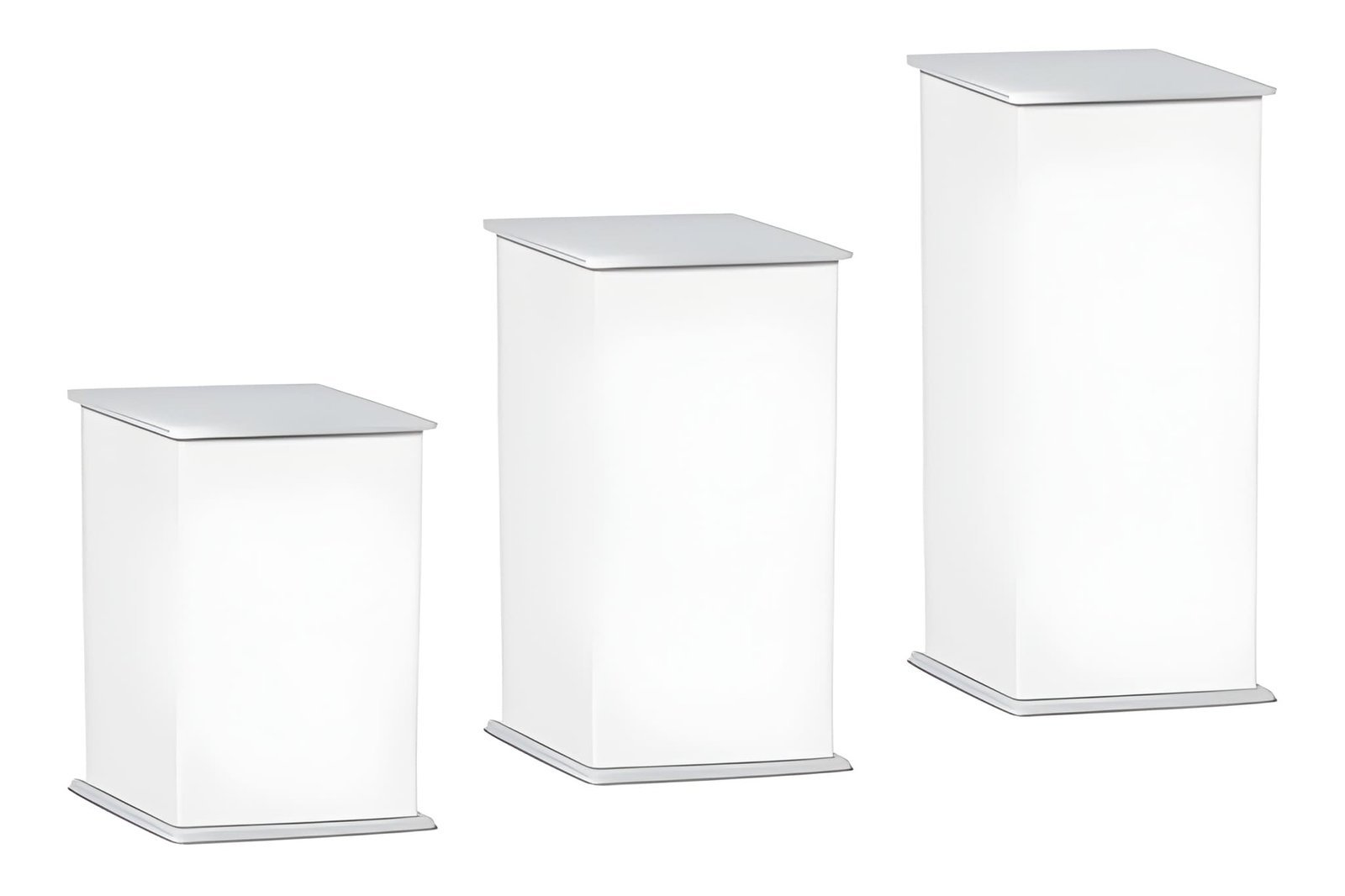
Height Creates Visibility Before Interest
In a busy market, customers aren’t browsing one stall in isolation. They’re moving through noise, people, signage, food smells, competing colours and other displays. A stall with vertical variation is easier to notice because it breaks the horizontal line of trestle tables.
Height helps products become visible from further away. Items placed slightly above table level can catch the eye of passing customers before they’re standing directly in front of the stall. This matters because attention often starts at a distance. A customer might notice a hero product, a colour block or a distinctive silhouette, then move closer to understand the rest of the range.
The aim isn’t to stack everything high. Too much height can become cluttered or unstable. The strongest displays usually use height selectively, giving key products a clear position while keeping the broader layout easy to read.
Levels Help the Eye Move Naturally
Good market stall design works a little like visual storytelling. The customer’s eye should move through the display without effort. Levels make that possible.
A single flat surface asks the customer to scan everything at once. That can feel visually tiring, especially when there are many small items. Creating low, medium and high points gives the display rhythm. The eye moves from one feature to the next, rather than bouncing randomly across the table.
This is especially useful for product ranges with different sizes, prices or uses. For example, a skincare stall might place gift sets at the back on raised blocks, everyday products at hand height, and smaller accessories near the front. A jewellery stall might lift statement pieces while keeping simple, lower-priced items closer to the customer. Each level has a job.
Visual Flow Reduces Decision Fatigue
Customers are more likely to engage when they can quickly understand what’s being sold. If a stall feels chaotic, they may keep walking, not because the products are wrong, but because the display takes too much effort to decode.
Visual flow helps reduce that friction. It shows people where to look first, what categories exist and how the products relate to one another. This can be done through height, but also through spacing, repetition and grouping.
A strong flow might start with a bold hero product at eye level, move down to a neat row of bestsellers, then finish with accessible impulse-buy items near the front edge. The layout quietly answers the customer’s first questions: What is this? Is it for me? Where should I start?
The Back of the Stall Matters More Than Many Vendors Realise
The rear section of a stall is often underused. Vendors sometimes place stock boxes, spare packaging or less important products there, but the back area is prime visual real estate. It’s usually the first part of the stall visible above the crowd and the best place to establish identity.
This doesn’t mean every stall needs a large backdrop or complex shelving. Even a simple raised display at the back can create depth and make the stall feel more complete. Products placed higher at the rear can frame the display, while lower products at the front invite touch and closer inspection.
The best setups often work from back to front. Taller items or display structures sit behind, medium-height products sit through the centre, and smaller items sit closest to the customer. This creates a clean visual slope that feels easy to approach.
Touchpoints Should Stay Within Easy Reach
Height is valuable, but accessibility still matters. Products meant to be handled, sampled or compared should remain comfortable to reach. If customers feel they might knock something over, stretch awkwardly or disturb a carefully arranged display, they may avoid interacting altogether.
Raised elements should support browsing, not create a barrier. Keep fragile or hero items elevated if they’re mainly for attention, but place shoppable stock where customers can pick it up easily. For tactile products, such as ceramics, textiles, candles or handmade goods, the display should invite contact without feeling messy.
A useful rule is to use height for attraction and mid-level or front-facing areas for interaction.
Clean Spacing Makes Products Look More Valuable
Crowded displays can sometimes make a stall look abundant, but there’s a fine line between full and overwhelming. Space gives products room to be understood. It also signals confidence.
When products are raised on separate levels, it becomes easier to create breathing room without leaving the stall looking sparse. A few well-positioned pieces can carry more visual weight than a table packed edge to edge.
Spacing also helps separate categories. Customers shouldn’t have to work out where one range ends and another begins. Clear gaps, repeated display heights and consistent product groupings make the shopping experience smoother.
Adaptability Is Key for Different Market Conditions
No two market days are exactly the same. Stall position, foot traffic direction, neighbouring vendors, weather and available space can all change how a display performs. Modular display pieces make it easier to adjust the setup without starting from scratch.
If most customers approach from the left, the main focal point may need to shift. If the stall is placed near an entrance, taller elements might need to work from a greater distance. If the market is crowded, clear vertical signage and raised products become even more useful.
A flexible display system lets vendors test what attracts attention, what gets handled and what leads to sales. Over time, those observations are often more useful than any generic display rule.
Final Thoughts
Market stall presentation isn’t just about making products look nice. It’s about helping customers notice, understand and engage with what’s in front of them. Height creates visibility. Levels give structure. Visual flow guides attention and makes browsing feel easier.
The strongest stalls don’t rely on one dramatic feature. They use small, intentional choices: a raised hero product, a clear back-to-front layout, accessible touchpoints, neat spacing and a display that can adapt to the day. When those details work together, the stall feels more professional, more inviting and easier to shop.